How to make your research accessible
A step-by-step guide
At Taylor & Francis, we’re committed to accessibility and we want to help you make your research accessible too.
Our thorough submission and production process means that many factors affecting accessibility are taken care of by Taylor & Francis, but there are actions you can take to help make your research accessible.
Here is our step-by-step guide to help you make your research accessible.
Why is accessibility important?
There are many reasons why you should make sure your research is accessible to as many people as possible.
Structure
Structuring your research paper in a logical way can help people with disabilities or users of assistive technology navigate the content and find the information they’re looking for quickly and easily.
Best practices for structuring your article
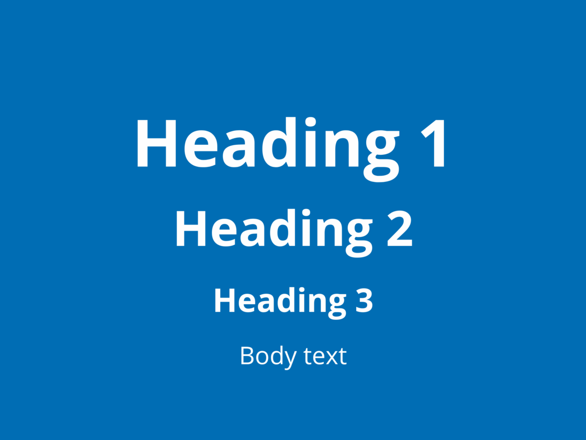
Headings and subheadings are key for organizing the structure of your research paper. Headings should:
Convey meaning and structure
Provide an outline of the content
Group related content and paragraphs
Provide a hierarchy of the content
Ordering headings and subheadings
Text cannot simply be made bold or a larger font size for it to be recognized as a heading. The heading style should be used for headings and subheadings.
Headings should be ordered according to a hierarchy: heading level 1 (H1), heading level 2 (H2), heading level 3 (H3), and so on. Heading levels may be repeated but you should not skip levels.
Formatting
Font
Use an accessible font style, such as Arial, Open Sans or Calibri.
Avoid stylized typefaces.
Font size
A minimum size of 16 point is recommended for people with visual disability.
Please note: some font sizes appear larger than others at the same point size.
Writing
Avoid writing words in capital letters. Words which are fully capitalized may be understood as an acronym by screen readers.
Avoid using underlines where you can.
Use plain language where possible.
Style tags
Use bold and italics only where necessary, as style tags cannot always be recognized by screen readers.
Accessibility checkers
Accessibility checkers can help verify your content against accessibility rules, and identify any potential issues for improvement.
There are many different accessibility checkers on the market, including Microsoft’s Accessibility Checker and the Acrobat Pro Accessibility Check feature in PDFs.

Image descriptions
What is alternative (alt) text and why is it important?
Alt text is a short piece of text accompanying an image or figure to convey to readers the nature or contents of the image. It is typically used by assistive technology to make the object accessible to people who have a visual disability and cannot read or see it.
Alt text will also be displayed in place of an image, if the image file cannot be loaded.
Alt text can also provide better image context/descriptions to search engines, helping them to index an image properly and improve the discoverability of your research.
Alt text is a key principle of accessible publishing, and Taylor & Francis are committed to ensuring that beginning early 2026, alt text is available for all images published in our journals.
Benefits of providing alt text
Inclusivity: providing the same opportunities to everyone.
Future-proofing your content.
Helping to raise awareness of the importance of accessibility.
Expands your audience reach and potential readership and engagement.
Helping to make an impact to real people in the world.
Discoverability: providing alt text can support search engine optimization for your academic article.
Example of alt text

Good alt text: Man in a blue and white checkered shirt, writing in an open notebook at his desk with his laptop open in front of him.
Alt text is not the same as a caption, which typically provides information that is not already in the visual element itself. Alt text should be:
Concise
Targeted
Unique
Clear
Simple
Consistent
Singular
Complete
An author’s guide to writing alt text
Taylor & Francis use advanced AI technologies to produce image descriptions and include them in your published content. For those authors wishing to provide image descriptions we have created guidance for authors on how to write effective image descriptions. The guide contains information about creating accessible content, and how to submit image descriptions with your article.

Taylor & Francis: alt text awareness
At Taylor & Francis, we’re committed to making sure all our products, platforms and websites are accessible to as wide an audience as possible. Alternative text was introduced into our eBook workflows in 2020 and a growing list of our journals are running alternative text trials.
Multimedia
Multimedia content associated with your research article also needs to be made accessible. The video below shows how Taylor & Francis Online are making the research we publish, accessible to as many people as possible.
Types of multimedia

Audio content, such as podcasts
Video content
Presentations
Animations, such as GIFs
Visual descriptions
Descriptions of visual information, sometimes called audio description, video descriptions, or described video, depending on the different media.
Visual descriptions provide people with visual disabilities the information they need to understand the information.
Transcripts
Transcripts are text versions of the speech and non-speech audio information.
Descriptive transcripts include text descriptions of visual content, too.
Transcripts can assist people with both audio and visual disability.
Captions
Also known as subtitles or closed captions, captions should be provided for video content.
Captions are text versions of the speech and non-speech audio information. Providing captions allows people who are hard of hearing to access the content.
Links
Links are important for accessibility. For instance, users of assistive technology may need to listen to a list of links, instead of reading them. Screen readers will notify users when they arrive at a link on a piece of content.
To create accessible links to use in your research paper:
Do not capitalize all letters in the link text.
Do not use the word ‘link’ as part of the link text.
Avoid using the words ‘click here’ to describe your link.
Do use meaningful words to describe your link.
Make sure links are a different color to the main body of your text.
Keyboard compatibility
Users must be able to navigate easily between headings, links, buttons and other controls by using the Tab key and other keystrokes. Here, we can think about traditional keyboards, but also modified keyboards and other hardware that mimics the functionality of a keyboard.
Who depends on this feature?
People who cannot use a mouse
People who cannot see the mouse pointer on the screen
People with chronic conditions and should limit or avoid the use of a mouse
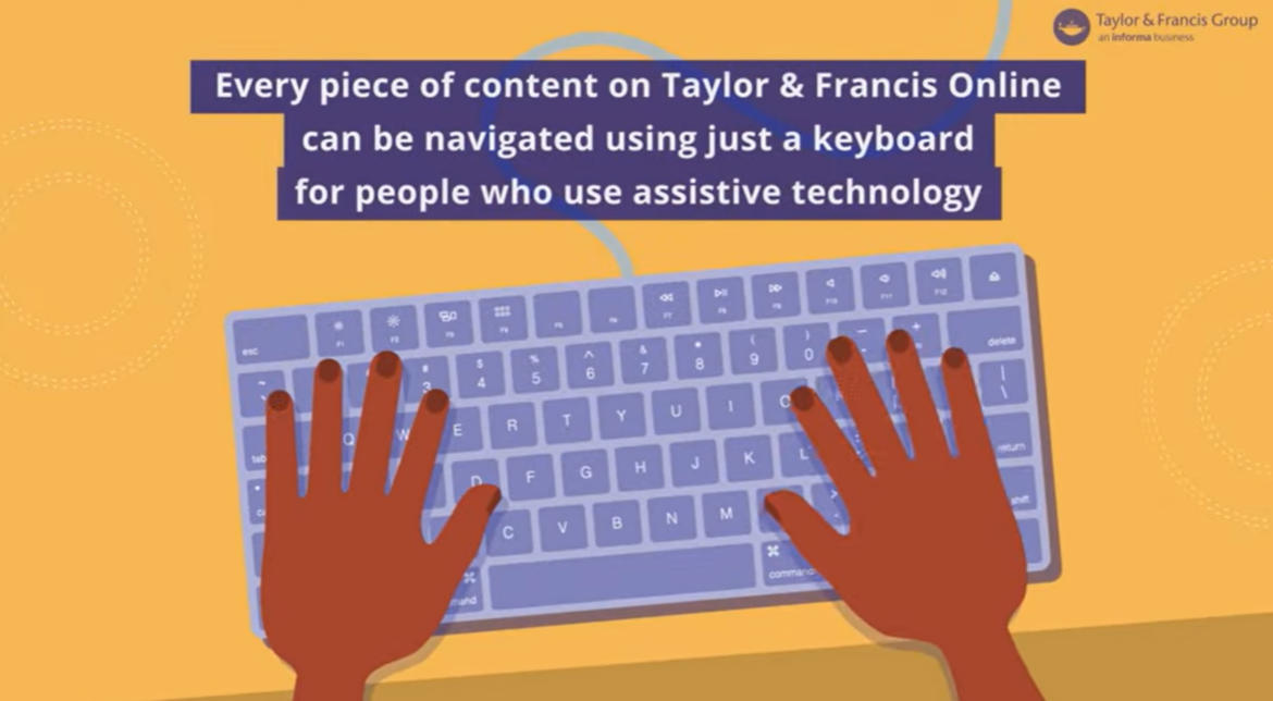
How to make your article keyboard compatible
Make sure your content is organized and structured
Use headings correctly throughout your research paper
Links are clearly inputted into the text
Ignore your mouse and test out the keyboard compatibility of your research article by using the keys on your keyboard solely.
Color
Color is important for accessibility because it can affect the way someone receives information visually. Choosing which colors to use in the images, figures, and tables in your research article needs careful consideration.
Best practices in using color for accessibility
Provide enough contrast between your text and the background.
Don’t rely on color alone to convey your message to your audience.
Ensure any links are a different color to the main body of your text.
Color contrast requirements
The minimum contrast value required to adhere to the basic standard of acceptable accessibility is 3.00. The contrast between the text and the background needs to be greater than, or equal to 4:5:1.

Need further help with writing your article?
Be prepared, speed up your submission, and make sure nothing is forgotten by understanding a journal’s individual requirements.